An early academic exercise at NYU focused on product deconstruction and rapid prototyping. I targeted Yelp to identify usability friction and architect a streamlined, intent-driven alternative. The goal: strip away feature bloat and refocus the experience purely on finding food and pricing with zero cognitive overhead.
While Yelp excels in community discovery, its core utility is often buried under significant cognitive load. My heuristic analysis revealed key friction points:
- Information Overload: Aggressive monetization and ads disrupt the primary user flow.
- Deep Navigation Paths: Critical data (menu, pricing) is buried behind multiple taps.
- Onboarding Friction: Forced login gates delay immediate value for high-intent users.


I defined an MVP centered around speed and frictionless discovery, built on these strategic pillars:
- Radical Simplification: A minimalist interface to reduce choice paralysis.
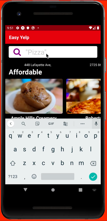
- Zero-Friction Entry: Removing all login gates for immediate value.
- Optimized Architecture: Surfacing high-priority metrics (price, proximity) instantly.
- Contextual Automation: Leveraging geolocation APIs to bypass manual input.
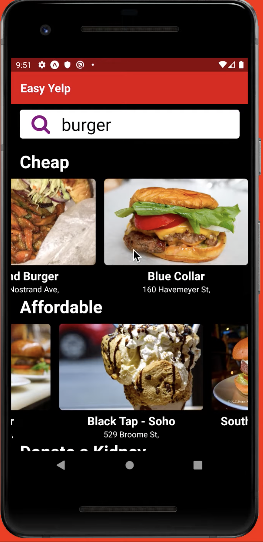
- Categorical Chunking: Organizing layouts by price to match user mental models.
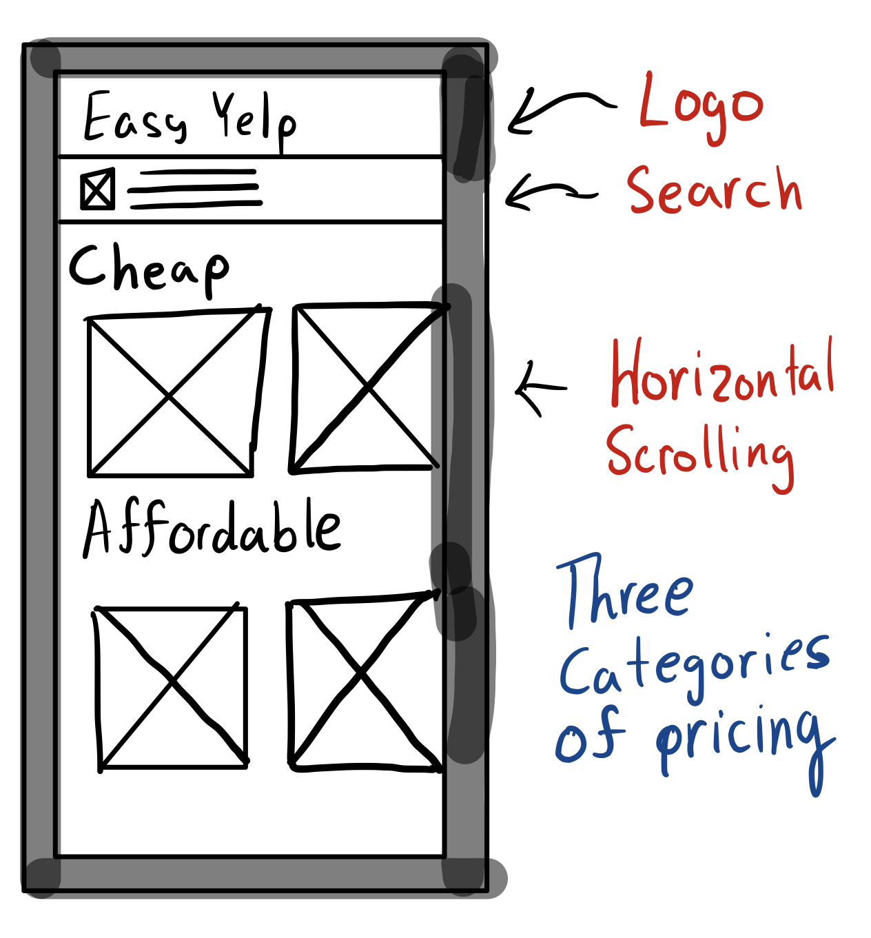
Rapid sketching established a new structural paradigm, prioritizing low interaction cost and high scannability.
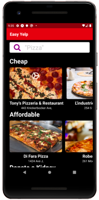
- Intent-Driven Home: A centered search bar immediately captures user intent.
- Categorized Discovery: Results organized by price tiers.
- Horizontal Navigation: Thumb-friendly horizontal scrolling for exploration.
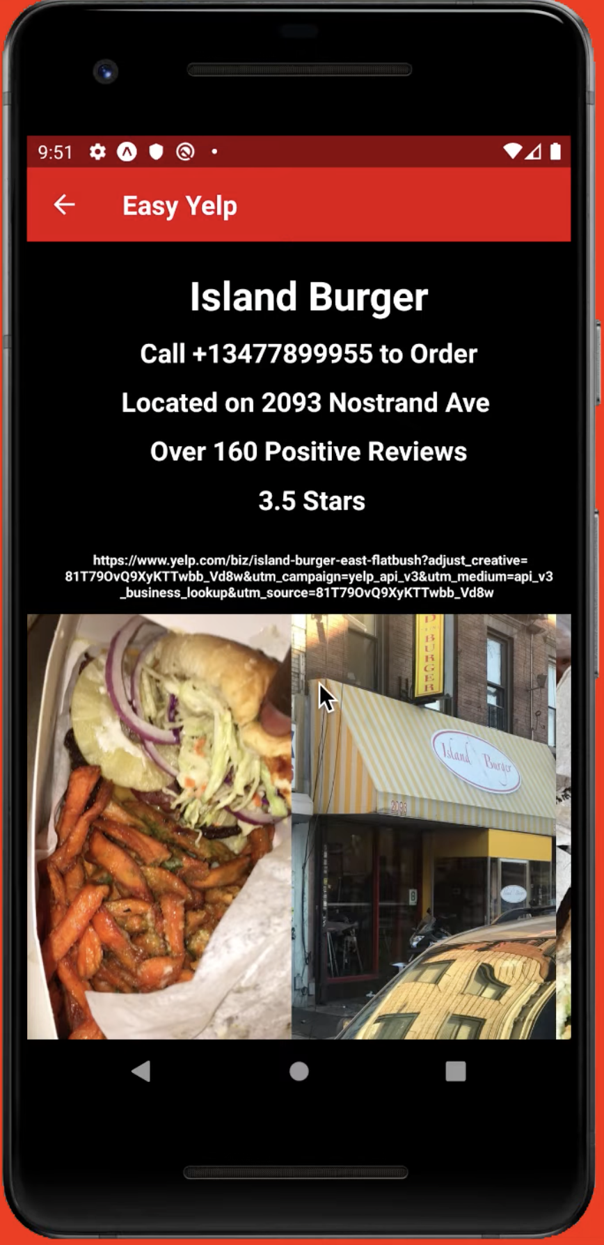
- Focused Detail Views: Vendor pages surface critical data at a glance, omitting social features.
- Uninterrupted Journey: A pure, ad-free environment.
Transitioning to a functional prototype, I built the app using React Native and Expo to validate UX decisions and iterate on micro-interactions in a tactile, native environment.

The prototype was deployed via Expo for real-world validation. By scanning a QR code, users could instantly test the native app, providing feedback on the streamlined journey and frictionless onboarding.
This foundational project at NYU shaped my early product philosophy, demonstrating that true design sophistication often lies in reduction. By challenging an industry giant's UX, I learned to ruthlessly prioritize features and execute a focused, user-centric vision—principles that continue to anchor my approach today.