amNY · Client work · Web
An ad-block gateway that nudges instead of blocking
How I helped amNY ask ad-block readers for support without locking them out of the story.
9 min read

The 30-second version
Explain the cost, keep the story open
Problem
Ad-blockers threatened almost 30% of amNY’s potential online ad revenue. The obvious fix, a wall, sends readers to another source.
My role
Product designer working with amNY’s engineers: interviews, competitive review, prioritization, journey mapping and the prototype.
Key decision
Don’t block. Use the empty ad slots to say plainly what blocking costs, and ask one last time after a deep scroll.
Outcome
A high-fidelity prototype of three dismissible messages, a banner, a sidebar and a last ask, designed to sit in the ad containers the site already had, worked out with amNY’s engineers.
Before · a wall
- Opens a story
- Hits an ad-block wall
- Finds it somewhere else
- No ads, no visit
After · a nudge
- Opens a story
- Sees why ads matter, in the ad slot
- Keeps reading
- Chooses to whitelist
Context
A free paper with a growing revenue gap
amNY is a daily New York newspaper with around 1.3 million monthly digital readers. Its journalism is free to read online, and advertising pays for it.
A growing share of those readers browsed with an ad-blocker. For them, every ad slot on the page was empty, and by the team’s estimate ad-blockers threatened almost 30% of potential online ad revenue.
The industry picture I cited at the time was the same. AdBlock Plus had passed 500 million downloads by 2014, and US publishers lost an estimated $15.8 billion to ad-blocking in 2016, up from $11 billion (PageFair, Statista and OnAudience figures).
The brief: win back some of that revenue without making amNY worse to read.
- Client
- amNY (AM New York), daily newspaper
- Readers
- About 1.3 million a month online
- Brief
- Recover ad revenue lost to ad-blockers, without hurting the reading experience
- Timeline
- 2 months

The challenge
Three things stood between amNY and its readers
- A revenue gapAlmost 30% of potential online ad revenue was at risk from ad-blockers.
- Walls push people awayBlocked from a story, 8 of the 14 people I interviewed went to find it somewhere else.
- Readers don’t see the cost11 of 14 didn’t know, or didn’t think about, what their blocker cost a site.
Who it is for
Fast readers, and the newsroom that needs them
Profiles built from the interview themes.
The high-velocity reader
Arrives from search or social, reads, moves on
- Needs
- The story, fast, without clutter.
- Before
- Runs an ad-blocker and leaves any page that walls them out.
The amNY business side
Keeps the paper free to read
- Needs
- Ad impressions, without driving readers to rivals.
- Before
- Empty ad slots, and nothing in them to explain why that matters.
The willing supporter
Would help, if someone asked nicely
- Needs
- A reason, and an easy way to pause the blocker.
- Before
- Pauses it only when a site forces the issue.
My role and process
Two months, from interviews to a prototype
My role: product designer.
- Interviews
14 ad-block users
Why they block, and what they do when blocked
- Synthesis
Pains and motivations
And one reader persona
- Market
3 publishers
Business Insider, Forbes and Vox
- Prioritize
5 ideas, one 2×2
Reader experience against cost
- Journey
Where the message lands
The moment a reader is open to it
- Prototype
Three messages
Banner, sidebar and the last ask
- Worked with
- amNY’s engineering team, to fit the messages into the site’s existing ad containers
- Tools
- Figma, WordPress, PowerPoint
Research
Five questions for people who block ads
I interviewed 14 people who use ad-blockers about why they block, and what they do when a site pushes back.
Other methods
Do they avoid ads in any other way?
Awareness
Do they know what ad-blockers do to the site they’re reading?
Breaking point
Which ads annoy them enough to install a blocker?
Acceptable ads
Are there any ads they’re OK with?
When blocked
What do they do when a site blocks the content?
People blocked ads because they were overwhelming, not to hurt anyone. Most had no idea what it cost a site, and an aggressive wall just sent them somewhere else.
What we heard
Blocked from a story, most people simply leave

- Friction · overloadAds distract from reading, so the blocker goes on and stays on.
- Friction · pausing is a choreNobody wants to fiddle with settings to read one story.
- Driver · fairnessSome felt seeing ads was the fairer deal, and that it helps small businesses.
Design principles
Five principles from the research
- Access
Never lock readers out
The story stays readable, whatever they decide.
- Honesty
Say why, plainly
One clear fact about what blocking costs, not a guilt trip.
- Placement
Use the ad’s own space
Messages live in the empty slots, so nothing new pushes the story down.
- Timing
Ask at the right moment
The bigger ask waits until someone has read most of the story.
- Respect
Ask once, always dismissible
Every message closes, and the last ask really is the last.
Competitive analysis
Loud walls, or a whisper nobody notices
Three publishers’ ad-block messages, judged on the same four questions.
Reviewed · 3 publishers
 Business Insider
 Forbes
 Vox
| Publisher | Grabs attention | No instant block-off | Invokes emotion | No log-in or subscription |
|---|---|---|---|---|
| Business InsiderBusiness news | Yes | NoFull-page message on arrival | No | NoOffers BI Prime for $1 |
| ForbesBusiness news | Yes | NoBlocked until you turn it off or sign in | No | NoGoogle sign-in or a mailing list |
| VoxGeneral news | NoBlends into the page | Yes | YesGives a reason | Yes |
| amNY · the targetWhat we aimed for | Yes | Yes | Yes | Yes |
Nobody paired Vox’s tone with the visibility of a wall.
Business Insider and Forbes got noticed, but blocked the story and gave the reason in small print. Vox explained itself kindly, in one spot that blended into the page. Our answer: messages as hard to miss as a wall, as kind as Vox, and never in the way of the story.
Competitive analysis · how they behaved
What a reader with an ad-blocker actually saw
Each publisher’s real message, as it appeared in 2020. The sites may behave differently today.
- Hard wallBusiness Insider
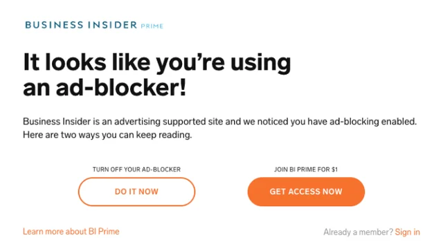
Source: Business Insider, my 2020 research How it works. A full message on arrival with no way to dismiss it. Two ways through: turn the blocker off, or join BI Prime for $1.
- Hard wallForbes
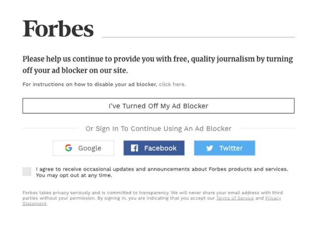
Source: Forbes, my 2020 research How it works. The story stays blocked until you say you’ve turned the blocker off, or sign in with Google, Facebook or Twitter to keep it on. Signing in comes with a mailing-list opt-in.
- Inline nudgeVox

Source: Vox, my 2020 research How it works. One ad slot becomes a kind ask with a reason and a how-to link. Nothing blocks the story, but the box blends into the page.


The walls got noticed but stopped the story. Vox kept the story open and gave a reason, but was easy to miss. So amNY’s messages take Vox’s tone and one-line reason, sit in the ad’s own space where readers already look, and always offer Dismiss. See the three messages
Prioritization
Five ideas, one 2×2
From the synthesis I had five ways to respond. I plotted each one by what it does to the reader’s experience and whether it pays off for amNY.

The key decision
Block, blend in, or ask?
The three serious options from the 2×2, judged against the five principles.
Deny access
Hide the story until the reader turns the blocker off or subscribes.

- Pros
- Cost-effective, and impossible to miss.
- Cons
- Locks readers out. 8 of 14 said they’d just find the story somewhere else.
Integrated ads
Quieter, native ad formats that look more like the page.

- Pros
- Kind to readers, and easier to tolerate.
- Cons
- Not cost-effective for amNY: new formats to sell and make, and blockers can still catch them.
Nudge readers to pause
Explain the cost in the empty ad slots, and let the reader decide.

- Pros
- Great for readers and cost-effective. Reuses slots the site already has.
- Cons
- Depends on readers choosing to act. Some will ignore it.
The decision
Explain, don’t block
It was the only option in the top-right of the 2×2: good for readers and worth it for amNY. It keeps the story open, and uses space that was already empty.
The certainty of a wall. A nudge only works if people choose to act, so the message has to be clear, visible and fair.
My hypothesis, the “empathetic pause”: if readers see what their blocker costs amNY, in a friendly voice and without losing the story, more of them will pause it.
Before and after
From empty slots to a clear ask


The solution
Three messages, one visit
The site notices the blocker and uses the empty slots to explain. The reader keeps reading and decides.
- Reader
Opens a story
From search or social, ad-blocker on
- Site
Shows the banner
In the top ad slot: what blocking costs
- Reader
Keeps reading
Nothing is locked
- Site
Explains how
The sidebar shows how to pause the blocker
- Site
Asks one last time
After a deep scroll, once
- Reader
Decides
Whitelists amNY, or dismisses it

The article page
Everything in its usual place


Ask in the ad’s own space
The banner takes the top slot the ad would have used, so nothing new pushes the story down.
The reason, in one line
Close to 30% of online revenue, said plainly. No guilt trip, no small print.
One action, and a way out
Whitelist amNY, or Not now. Both are always there.
The sidebar explains how
Three short steps to pause a blocker, and a reminder that reading never depends on it.
The story stays open
No wall, no countdown. The article reads exactly as it would with ads.
The messages
Visible, kind, and easy to dismiss
Three messages, each in a space the page already had.

Across the site
The same idea on every screen
Desktop and phone screens.


Outcome
A nudge amNY could drop into its own pages
Interview findings, a persona, the competitive review, the 2×2, a journey map and a high-fidelity prototype of the three messages, built around the site’s existing top and side ad containers.
A no-wall approach: every message dismissible, the story always open, and the last ask shown only once.
The share of ad-block readers who whitelist amNY, and whether bounce and return visits hold steady.
Reflection
What I took from it
Test it, don’t argue it
Next time I’d A/B test the messages against no message at all, so the case for the nudge rests on numbers, not opinions.
Tone is the product
My first prototype leaned on stock photos and jokes. The final design keeps the voice plain and kind, and lets one fact do the work.
Design for the second visit
“Last time we’ll ask” only builds trust if the site remembers. I’d spec that memory as carefully as the messages.
Appendix
Additional material
More screens and artifacts from the project.
A1Research plan and synthesis


A2Interview charts

A3Competitors’ ad-block messages


A4Prioritization and journey


A5The first prototype
