Stealth startup · Client work · Mobile app
Helping people remember accessibility rules after a one-day seminar
Accessibility 101: a mobile companion that keeps a one-day accessibility seminar going, one question at a time.
8 min read

The 30-second version
One question a day, so the seminar sticks
Problem
The client taught accessibility in one-day seminars, and most of it was forgotten soon after, with nothing to bring people back.
My role
Product designer in a small design pod: interviews, synthesis, competitive review, information architecture, flows and the prototype.
The solution
A mobile companion with one bite-sized WCAG question a day, a reason step that teaches the rule, gentle reminders and a team leaderboard.
Outcome
A clickable prototype and a site map, flow and screen set the client could take into the next round of design and testing.
Before · the seminar alone
- One full day of guidelines
- Too much to hold at once
- Nothing afterwards
- Mostly forgotten
After · with the app
- The same seminar
- One question a day
- The rule behind the answer
- A team leaderboard
Context
A great day of training, then nothing
The client was an early-stage company teaching digital accessibility to designers, developers and content teams. It is still in stealth, so I don't name it here.
Its core product was a one-day seminar. People left inspired and full of new rules, then went back to deadlines. Weeks later, most of what they had learned was gone, and the company had no way to stay in touch between sessions.
The brief: design something that keeps the learning going after the seminar ends, and gives people a reason to come back to it.
- Client
- Accessibility-training startup, in stealth
- Brief
- Reinforce seminar learning and keep people engaged afterwards
- Platform
- iOS app (prototype)
- Timeline
- 3 months
The challenge
Three things worked against remembering
- Too much in one dayA full day of guidelines is more than anyone can hold at once.
- Nothing afterwardsNo practice or follow-up once the seminar ended.
- No reason to returnNothing tied people to the company, or to each other, between sessions.
Who it is for
Busy people who already know why accessibility matters
Profiles built from the interview themes.
The web designer
Back from a seminar, straight into deadlines
- Needs
- Quick reminders of the rules she uses most.
- Before
- Searches the guidelines when a review flags a problem.
The developer
Wants the answer, not a lecture
- Needs
- Short, practical examples in code.
- Before
- Skips long reading and video formats.
The student
Learning to build for the web
- Needs
- Regular practice, with feedback.
- Before
- Studies in bursts before a deadline.
My role and process
Three months, from interviews to a prototype
My role: product designer.
- Interviews
4 questions
Educators, students and tech professionals
- Synthesis
Friction, drivers, personas
What gets in the way, what keeps people going, and who
- Market
4 providers
What existing training offers, and what it doesn't
- Structure
Site map and flow
One daily loop at the center
- Design
Wireframes and prototype
Onboarding, quizzes, leaderboard, learn
- Reflect
Validate first
What I'd change next time
- Worked with
- A small design pod, and the client's founders for feedback
- Tools
- Photoshop, PowerPoint
Research
Four questions guided the interviews
I spoke with educators, students and tech professionals about how they learn, and how they react when something asks for their attention.
Engagement
How does the client keep people engaged during and after a seminar today?
Study habits
What study methods do students actually use?
Notifications
How do people respond to notifications after an event?
Channel
How do they feel about learning through an app, a website or email?
People wanted to keep learning, but only in small pieces that fit around work. Feedback and a little friendly competition kept them going; long lectures and reading did not.
What we heard
Short, social and on their own terms

- Friction · timeTraining competes with deadlines, so it has to take minutes, not hours.
- Friction · alert fatigueToo many pings and people switch them all off.
- Driver · feedbackUpskilling, quick feedback and a little competition with their team.
Design principles
Five principles from the research
- Size
A minute a day
One question at a time, never a module.
- Relevance
Fit the job
Questions match the person's role, from design to QA.
- Feedback
Teach the why, instantly
Every answer ends with the guideline behind it.
- Social
Learn with your team
A friendly leaderboard, never a public ranking of strangers.
- Nudges
Respect attention
One reminder a day, at a time the person sets.
Competitive analysis
Plenty to read and watch, almost nothing to practice
Four accessibility-training providers, compared on the same four questions, as reviewed at the time.
Reviewed · 4 providers
 Deque
 Lynda.com (now LinkedIn Learning)
 W3C
 WebAIM
| Provider | In-person class | Online videos | Online reading | Games or interactivity |
|---|---|---|---|---|
| DequeAccessibility specialists | Yes | Yes | Yes | No |
| Lynda.com (now LinkedIn Learning)General online courses | No | Yes | No | No |
| W3CThe standards body | No | PartlyMainly promotional | Yes | No |
| WebAIMAccessibility non-profit | PartlyIn Utah only | Yes | Yes | Yes |
In my review, none offered short daily practice.
Most of the material was long reading or video, and only WebAIM had anything interactive. Our answer: keep the seminar, and add a minute of interactive practice every day, with a team to do it with.
The key decision
How should follow-up learning reach people?
Three formats, judged against the five principles.
An email series
A weekly email recapping one topic from the seminar.

- Pros
- Cheap to run. Most people check email at least twice a day.
- Cons
- One more email among many, with no practice and no feedback.
An online course
Video modules and reading on the client's website.

- Pros
- Room for depth, and easy to update.
- Cons
- Long sessions people said they skip, and nothing that brings them back.
A mobile companion
One question a day, a reminder, and a team leaderboard.

- Pros
- Fits a minute a day. The only format that can nudge, quiz and rank in one place.
- Cons
- Costs more to build, and people have to install it.
The decision
Interactive quizzes, in a mobile companion
Only an app could deliver a minute of practice where people already are, with instant feedback and a team to compare with. That covers four of the five principles by design.
The reach of email and the depth of a full course. Deeper reading stays one tap away, in Learn.
My hypothesis: a gamified daily companion would keep people practicing long after the seminar.
Wireframe to app
Same parts, clearer hierarchy


The solution
One small loop, every day
A nudge, a question, the reason, the rule, and the leaderboard. The app does the scheduling; the person only spends a minute.
- App
Sends one reminder
At the time the person chose
- Person
Answers the question
Yes, no or sometimes
- Person
Says why
Picks the reason behind the answer
- App
Shows the rule
The guideline and why it matters
- App
Updates the leaderboard
Points and streak, within the team
- Person
Reads more, if they want
Learn and Search, any time

The home screen
Everything for today, on one screen

A streak, not a score
Days in a row matter more than points. Missing one day costs nothing but the streak.
The guideline, up front
Every question names the WCAG rule it teaches.
One clear action
One question, one button, about a minute.
You, among your team
The leaderboard shows your own team, so the competition stays friendly.
Labeled tabs
Every tab has a text label, not just an icon.
Interactive quizzes
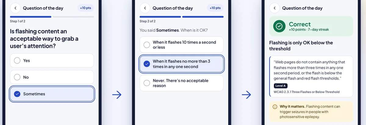
Answer, then say why
A right answer can be a guess. Asking for the reason turns it into understanding, and the result screen always quotes the guideline.
The app
The rest of the app


Outcome
A prototype the client could build on
Research findings, personas, a competitive review, the site map and user flow, and a clickable prototype of the core screens.
A clear product idea, interactive quizzes in a daily companion, with the reasoning behind it from the interviews.
How many people keep a weekly streak after a seminar, and how many turn reminders off.
Reflection
What I took from it
Validate the structure first
Next time I'd test the MVP's structure, the daily loop and the site map, before spending time on screens.
Interviews are a design problem too
Better-framed questions would have given us sharper answers about habits, not just opinions.
Practice what it preaches
My first wireframes used light-blue headings on white and tiny tab labels. An accessibility app has to pass its own test, so the final design fixes both, and I'd test with screen-reader users next.
Appendix
Additional material
More screens and artifacts from the project.
A1Site map and user flow


A2The wireframes


A3Interview charts

A4Competitive analysis slides

