Schneps Media · Client work · Web
A podcast hub built for listening, not reading
How I turned Schneps Media’s podcast pages, built like articles, into a responsive hub with a player that stays while you browse.
11 min read

The 30-second version
Give audio a home of its own
Problem
Schneps’ podcasts lived on pages built for articles. Episodes were hard to find, hard to play and looked the same, and every producer uploaded them differently.
My role
Product designer, end to end: research with listeners and producers, a competitive review, prioritization, wireframes, the hi-fi design and a creator style guide.
Key decision
Build a purpose-built hub on WordPress with a player that stays while you browse, instead of re-skinning the article page or embedding someone else’s player.
Outcome
A home, series and episode design for desktop and mobile, numbered episodes, and one upload template so every show arrives complete.
Before · an article
- Lands on a page built like an article
- Hunts for the episode
- Leaves to play it elsewhere
- Playback stops when they move on
After · a hub
- Lands on every show at a glance
- Picks a numbered episode
- Plays it right there
- Keeps browsing, player stays
Context
A newsroom that started talking
Schneps Media owns and operates more than 50 print and online news services across New York. As audio took off, its newsrooms started making podcasts: shows about real estate, the boroughs, the Hispanic community, LGBTQ+ stories and women in business.
The shows lived together on one podcast site, but that site had grown out of the article template. A show was a block of text, an episode was a link, and pressing play meant leaving the page or losing your place.
The brief: give Schneps’ podcasts a home that feels made for listening, that producers can keep tidy, and that works on the phone where people actually listen.
- Client
- Schneps Media, more than 50 print and online news services
- Product
- The Schneps podcast site, on WordPress
- Brief
- A responsive, audio-first home for every Schneps show
- Timeline
- 3 months

The challenge
Five things stood between the shows and their listeners
- Built like an articleThe layout came from the news template, so audio was buried in text.
- Hard to get aroundNo clear way from a show to its episodes, or from one show to the next.
- Nothing stood outEvery show looked the same, and none of it felt like Schneps.
- No upload standardEach producer posted episodes their own way, so titles, numbers and notes were all over the place.
- No real mobile viewThe site wasn’t responsive, on the device most people listen on.
Who it is for
Two sides of the same show
Profiles built from the interview themes.
The commuting listener
A student who listens in the car, and a fan of one Schneps show
- Needs
- One place to find new shows, and the extra material hosts mention on air.
- Before
- Hears “the photos are on our website”, then forgets where to look.
The newsroom producer
Makes and posts a weekly show
- Needs
- A quick, clear way to publish an episode that looks right every time.
- Before
- No guidelines, so every upload is a fresh guess.
Schneps Media
Wants its audio to grow, on its own platform
- Needs
- A hub that shows off every show and keeps listeners on Schneps’ site.
- Before
- A podcast section that looked like any other news page.
My role and process
Three months, from interviews to a hub
My role: product designer.
- Interviews
Listeners and producers
Five questions for both sides
- Synthesis
Pains and motivations
And one listener persona
- Market
5 competitors
Vox, Wondery, iHeart, NYT and CNN
- Prioritize
MoSCoW
What the first release must do
- Wireframes
Home, series, episode
Refined with feedback
- Hi-fi
Desktop and mobile
Plus the creator style guide
- Worked with
- Schneps’ podcast producers, as interviewees and the audience for the style guide
- Tools
- Figma, WordPress, PowerPoint
Research
Five questions, asked of both sides
I ran a two-sided study: listeners, who use the site, and producers, who fill it.
How they listen
What’s their main way of listening to podcasts?
How they upload
What guidelines do producers follow today?
Getting around
How could navigation on the site be better?
Style guides
How would producers feel about a shared style guide?
Beyond the audio
What else would they use the site for?
Listeners felt the site wasn’t made for audio: finding an episode took too long, and the extras hosts mention on air were hard to track down. Producers wanted rules, because without them every upload looked different.
What we heard
The visuals didn’t land, and getting around was hard

- Friction · discoveryFinding a particular show or episode took too much effort.
- Friction · the extrasPhotos and links mentioned on air had no obvious place to live.
- Driver · streaming habitsListeners expected the ease of the apps they already use.
Design principles
Five principles from the research
- Audio first
Play is always one tap away
Every show and episode can start right where you see it.
- Continuity
The player stays
Browsing never stops what you’re listening to.
- Order
Number every episode
Seasons and numbers make a back catalog easy to follow.
- Extras
Notes in one place
What a host mentions on air is on the episode page.
- Mobile
Made for one hand
The phone is where people listen, so it gets full parity.
Competitive analysis
Good players, but the extras were missing
Five publishers’ podcast pages, judged on the same four features.
Reviewed · 5 publishers
 Vox
 Wondery
 iHeartRadio
 The New York Times
 CNN
| Publisher | Persistent player | One style format | Episode numbering | Supplementary info |
|---|---|---|---|---|
| VoxNews and culture | Yes | Yes | No | No |
| iHeartRadioAudio network | Yes | Yes | Yes | No |
| The New York TimesNews | No | No | Yes | Yes |
| CNNNews | No | Yes | No | No |
| WonderyPodcast studio | Yes | Yes | Yes | No |
| Schneps · the targetWhat we aimed for | Yes | Yes | Yes | Yes |
Nobody paired a player that stays with the extras.
Vox, iHeartRadio and Wondery kept a player on screen. Only The New York Times added extras. Our answer: both, with numbered episodes and show notes on every episode.
Competitive analysis · how they behave
What a listener actually gets on each site
All five as they were in early 2020. The sites have changed since.
- Embedded playerVox
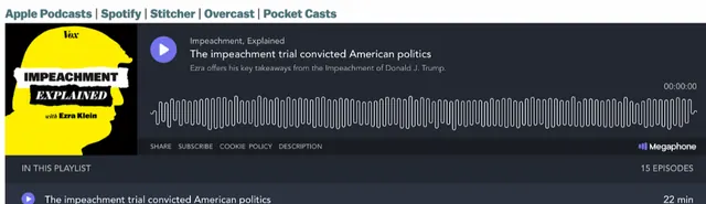
Source: vox.com. How it works. Each show page embeds a third-party player with the whole playlist under it, plus links out to podcast apps. One cover for the whole series, and no episode numbers.
- Audio appiHeartRadio
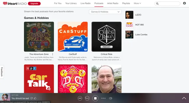
Source: iheart.com. How it works. Podcasts live inside a full audio app: shows grouped by category, and a player bar along the bottom that keeps playing while you browse.
- Listen elsewhereCNN
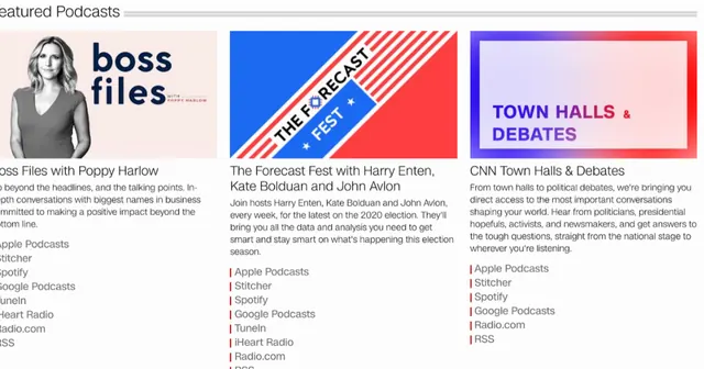
Source: cnn.com. How it works. Each show is a cover, a blurb and a stack of links to other apps. There’s no player on the page, so listening happens somewhere else.
- Cover gridWondery
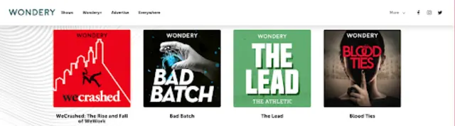
Source: wondery.com. How it works. A grid of big show covers, much like iHeart. In my review, episodes played in an embedded third-party player, as on Vox.
- ExtrasThe New York Times
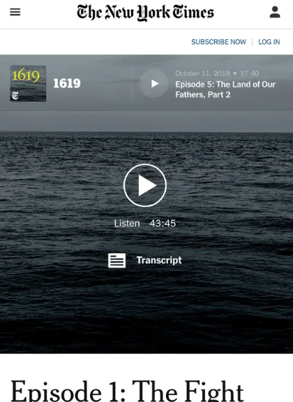
Source: nytimes.com on mobile. How it works. An episode opens on a full-width player with play, running time and a Transcript button. The only extras in the review.


Each site solves one piece. Vox and iHeart keep a player on the page, iHeart and Wondery show every show at a glance, CNN sends you to other apps, and the Times adds a transcript. So the Schneps hub does all of it on Schneps’ own site: a player that stays, Listen where you like, numbered episodes and show notes. See the series page
Prioritization
What the first release had to do
From the research and the review I sorted features into must, should, could and won’t.

The key decision
Re-skin, embed, or build a hub?
Three ways to give the shows a better home, judged against the five principles.
Restyle the article template
Keep the article structure and give it a podcast look.

- Pros
- Fast, and nothing new for the newsroom to learn.
- Cons
- Keeps the article structure that made audio hard to find, and playback still stops when you leave.
Embed third-party players
Drop a hosted player, Art19-style, into each show page, as some competitors do.

- Pros
- A proven player, with little to build.
- Cons
- A stack of players, not a site. Schneps wanted a platform of its own, so it was a won’t.
Build a podcast hub
A purpose-built WordPress hub with a player that stays while you browse.


- Pros
- Fixes navigation and playback together, and stays Schneps’ own.
- Cons
- The most work, and producers need a new way to upload.
The decision
Build the hub, and keep the player on screen
It was the only option that fixed both how people find episodes and how they play them, and it kept the platform in Schneps’ hands.
The speed of a re-skin. A new hub needed a new upload flow too, so I designed the creator template alongside it.
My hypothesis: restructure the site around audio, add a player that stays, and standardize how episodes arrive, and listening gets easier for everyone.
Before and after
From an article index to a hub

The solution
Find it, play it, keep browsing
Listeners land on every show at once, pick an episode, and play it there or in their own app. The player follows them around the site.
- Listener
Opens the hub
From a story, a show mention or search
- Site
Leads with what’s new
A banner for the latest episode, then every show
- Listener
Picks a show
Numbered episodes, two-line descriptions
- Listener
Presses play
Here, or in Apple Podcasts or Spotify
- Site
Keeps the player
Pinned to the bottom on every page
- Site
Serves the extras
Chapters and show notes on the episode page

The series page
Everything about a show, in one place


Listen where you like
Apple Podcasts, Spotify, Stitcher and Google Podcasts, right under the show, for people who’d rather use their own app.
Every episode numbered
Season and episode numbers make a back catalog easy to follow, and the newest is always on top.
Two lines, then more
A short description in the list, with share, download and show notes one tap away.
Discover the next show
Other Schneps shows sit beside the episodes, so one show leads to another.
A player that stays
Playback carries on while you browse. No autoplay on first load.
The producer side
One template, five rules
Most producers said a style guide would help, so I designed the upload template and the rules together.

Across the hub
The same player on every screen
The episode page on desktop, and the phone screens.


Outcome
A hub Schneps could build on WordPress
Research with listeners and producers, a persona, the competitive review, a MoSCoW, wireframes, and hi-fi home, series and episode designs for desktop and mobile, plus the creator template and style guide.
An audio-first hub on Schneps’ own platform: numbered episodes, a player that stays, notes on every episode and a fully responsive mobile view.
How easily listeners find an episode, how far they listen, and how many episodes arrive complete.
Reflection
What I took from it
Structure before style
The new look was the visible part, but the real fix was the information architecture. A pretty page that’s hard to navigate still fails.
Audio has its own patterns
A player that stays, episode numbers and chapters aren’t decoration. The visuals should support listening, not compete with it.
Design for both sides
A listener only sees a tidy show if the producer had an easy way to make it tidy. The template mattered as much as the screens.
Appendix
Additional material
More screens and artifacts from the project.
A1Research plan

A2Interview charts

A3Prioritization and features


A4Flow and wireframes


A5The hi-fi designs

